Wednesday, 16 March 2016
Thursday, 10 March 2016
Effects Editing
 I have been editing in After Effects to achieve certain visual effects in our film.
One example is in the opening car scene. Due to filming whilst stationary, the reflection in Georgie's (Addie) glasses shows that she wasn't moving, as we were just filming in front of a green screen. To give the impression of her travelling, I have taken some of the moving GoPro footage and placed it translucently onto her glasses. This makes the idea of her being in a moving car more believable.
Friday, 4 March 2016
Emily- Psycho Title Research
Psycho

Psycho begins by showing the distributors of the film, A Paramount Release. This does not give much information about the plot towards spectators, however, does give us institutional information.

As the film sequence starts, immediately we are told that it is a Alfred Hitchcock film. Psycho was released in 1960, therefore was a black and white film. Due to the black and white, all titles are very plain, however animated in a very effective way to fit the film title and story. The non-diegetic sound is extremely dramatic and intense, this is created playing strings in a minor scale, gradually building up when getting closer to the opening scene.
Using Alfred Hitchcock before showing the film title, engages spectators. This is due to the star power in films. The more famous directors and actors mentioned, the more spectators will be persuaded and influenced to watch.

The title 'Psycho' is animated in a way that relates to the film title. For example, as shown in the screen grab, 'Psycho' is edited as if the font is broken up and unbalanced, connoting a mood of unease and enigma. This title and animation generates this atmosphere and moods due to what we intake the animatics as, such as: missing pieces and unsteady, generating speculation of what will take place in the film.
 Saul Bass, the designer of Psychos title sequence uses a series of simple white bars to usher in the
sans-serif titles and escort them back out again. The animation of these lines
and the type itself are just as reserved every object has a path from which it
does not deviate. On, off, left, right, up, down, black, white those are Bass’s
self-imposed restrictions on Psycho, and he employs them with
dramatic effect.
Saul Bass, the designer of Psychos title sequence uses a series of simple white bars to usher in the
sans-serif titles and escort them back out again. The animation of these lines
and the type itself are just as reserved every object has a path from which it
does not deviate. On, off, left, right, up, down, black, white those are Bass’s
self-imposed restrictions on Psycho, and he employs them with
dramatic effect.
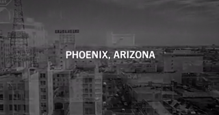
After the credits in the title sequence, we then are shown an establishing shot of which we are told as a caption, is in Phoenix, Arizona. This informs us as spectators of the location and that it is an American film. The long establishing eye-level shot of many hotels, allows spectators to predict the next shot, maybe in a hotel room?

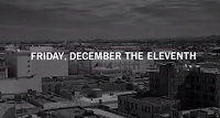
These two captions present the date and time of the footage showing. This gives spectators a greater understanding of the context we are wanted to understand. These captions are overlapped on played footage of a city.
In my opinion, I think that the order that the titles are presented is because we first as spectators need to be engaged by star power. This is a clever technique as star power is extremely powerful to society, even in the 1960's. Star power also begins to speculate word of mouth by more and more people beginning to tell their friends and family. After the star power of the director Alfred Hitchcock being introduced, secondly we are shown the film title, making the spectators aware of the name of the thriller film. The word 'Psycho' which means a psychopath, creates anxiety for spectators for what is to come in the film.
Title Sequence of PSYCHO

Psycho begins by showing the distributors of the film, A Paramount Release. This does not give much information about the plot towards spectators, however, does give us institutional information.

As the film sequence starts, immediately we are told that it is a Alfred Hitchcock film. Psycho was released in 1960, therefore was a black and white film. Due to the black and white, all titles are very plain, however animated in a very effective way to fit the film title and story. The non-diegetic sound is extremely dramatic and intense, this is created playing strings in a minor scale, gradually building up when getting closer to the opening scene.
Using Alfred Hitchcock before showing the film title, engages spectators. This is due to the star power in films. The more famous directors and actors mentioned, the more spectators will be persuaded and influenced to watch.

The title 'Psycho' is animated in a way that relates to the film title. For example, as shown in the screen grab, 'Psycho' is edited as if the font is broken up and unbalanced, connoting a mood of unease and enigma. This title and animation generates this atmosphere and moods due to what we intake the animatics as, such as: missing pieces and unsteady, generating speculation of what will take place in the film.
 Saul Bass, the designer of Psychos title sequence uses a series of simple white bars to usher in the
sans-serif titles and escort them back out again. The animation of these lines
and the type itself are just as reserved every object has a path from which it
does not deviate. On, off, left, right, up, down, black, white those are Bass’s
self-imposed restrictions on Psycho, and he employs them with
dramatic effect.
Saul Bass, the designer of Psychos title sequence uses a series of simple white bars to usher in the
sans-serif titles and escort them back out again. The animation of these lines
and the type itself are just as reserved every object has a path from which it
does not deviate. On, off, left, right, up, down, black, white those are Bass’s
self-imposed restrictions on Psycho, and he employs them with
dramatic effect.
After the credits in the title sequence, we then are shown an establishing shot of which we are told as a caption, is in Phoenix, Arizona. This informs us as spectators of the location and that it is an American film. The long establishing eye-level shot of many hotels, allows spectators to predict the next shot, maybe in a hotel room?


These two captions present the date and time of the footage showing. This gives spectators a greater understanding of the context we are wanted to understand. These captions are overlapped on played footage of a city.
In my opinion, I think that the order that the titles are presented is because we first as spectators need to be engaged by star power. This is a clever technique as star power is extremely powerful to society, even in the 1960's. Star power also begins to speculate word of mouth by more and more people beginning to tell their friends and family. After the star power of the director Alfred Hitchcock being introduced, secondly we are shown the film title, making the spectators aware of the name of the thriller film. The word 'Psycho' which means a psychopath, creates anxiety for spectators for what is to come in the film.
Title Sequence of PSYCHO
Nathan Seven Title Research
 In the opening sequence of Seven, the Thriller genre is introduced through the use of enigmatic and horrifying titles which match the content of the scene. The font used is irregular and looks handwritten, which could be to replicate the idea of the character in the scene writing things down. The text flickers to create a sense of disruption and mystery, as if it is unsure where to be positioned. This effect instills a sense of discomfort in the spectator as we don't know what will happen next, including what the title will do next. This is why animated flickering titles are common in many Thriller films.
 The importance of the film's title is highlighted by the way it flickers bigger than any other title in the sequence. This helps to differentiate between this title and any other, and is therefore a fitting introduction to the film. The use of the number 7 as a clever part of the logo creates extra emphasis on the number, meaning it is an essential part of the film and already gets the spectator questioning what relevance the number has to the plot. It also makes the title clearly distinguishable from any other title or name of another product. When we see it written "Se7en", we automatically associate it with the film.
 The sequence culminates in showing the name of the director, just as is common in many other films. This is the last title we see, in order for it to be left in our minds as it is the most important credit, because it shows the most important member of the crew. It is placed onto a black background unlike many of the other titles which were on top of the video, this adds extra emphasis and importance to the moment we see the directors name. With it being the name of a popular director, David Fincher, we are sure to see his name to give a feeling of assurance that it will be a good film as it has a reliable director known for being in charge of many other large productions.
Gone Girl Title Analysis
Gone Girl
The movie begins with distinct eerie, droning music playing over the production company titles and throughout the opening title sequence, This use of non-diegetic sound captivates the movies suspicious atmosphere, leading the audience into a state of suspense. The opening close-up shot fades in from a black screen and is of the protagonist's hair being stroked. This action's tone is manipulated to seem somewhat sinister because the shot is from the perspective of the person stroking the hair, as if they are watching the woman and stroking her without her knowing. This follows the typical thriller narrative of being watched which makes the audience uncomfortable with the situation.


The movie begins with distinct eerie, droning music playing over the production company titles and throughout the opening title sequence, This use of non-diegetic sound captivates the movies suspicious atmosphere, leading the audience into a state of suspense. The opening close-up shot fades in from a black screen and is of the protagonist's hair being stroked. This action's tone is manipulated to seem somewhat sinister because the shot is from the perspective of the person stroking the hair, as if they are watching the woman and stroking her without her knowing. This follows the typical thriller narrative of being watched which makes the audience uncomfortable with the situation.
The non-diegetic voice over informs us it is her husband,
which makes this scene more comforting and loving than creepy. Although during
the voice over the husband explains how he imagines “cracking her skull [and]
spooling her brains on the floor.” Our perception of the husband is now that he
is psychotic because of the nature in which he described his wife’s death so
calmly, as if it was normal. A sane person wouldn't do this and so we are led
to believe he is psychotic and this conforms to the genre’s conventions, as
psychos are common thriller characters.
The editing of Gone Girl’s opening sequence has used a lot
of fade transitions and animations to portray the vanishing of the protagonist.
James Bond: Skyfall title analysis
Skyfall
The sequence begins with a man in a suit falling into water, as we hear a non-diegetic sound fade into a soft piano. This creates a dignified tone to suggest this character is dead, even more so when the scene fades to black, immediately creating some enigma as we recognise this man as the character James Bond. However a hand grabs him as the words "this is the end." are sung. The soft female voice over the piano backing the track creates a quiet, moody atmosphere with a lot of mystery, we don't know what is going on in the sequence for the most part, it relies heavily on connotations to suggest things that may play a role in the overall film.

The text 'Skyfall' appears on the screen as the man (Bond) falls through a gap that has appeared in the sea bed as Adele sings "feel the Earth move". We get teh impression from these first few lines of song that the song matches the film and the lyrics could suggest what will happen in the film. Mise-en-scene is used to great effect in this opening scene as various objects seem to fly across the screen as the camera follows the movement of the inactive body of Bond.

For instance, a cut-out of bond with bullet holes in him and a single bleeding wound under his right shoulder drifts across the scene and makes the audience ask questions - Why has this been place here?, What is its significance to the plot? A convention used in various thriller movies.

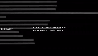
Other information shown in the opening title sequence include institutional information such as the production company 'Albert R.Broccoli's EON Productions LTD'. The sequence also includes the actor of the protagonist 'Daniel Craig'and the author 'Ian Fleming' in which the movie is based on his series of books. The style of the title is a serif font which is closely spaced and moves fluidly with the water, this makes it look more natural and may foreshadow what might happen in the story.
The sequence begins with a man in a suit falling into water, as we hear a non-diegetic sound fade into a soft piano. This creates a dignified tone to suggest this character is dead, even more so when the scene fades to black, immediately creating some enigma as we recognise this man as the character James Bond. However a hand grabs him as the words "this is the end." are sung. The soft female voice over the piano backing the track creates a quiet, moody atmosphere with a lot of mystery, we don't know what is going on in the sequence for the most part, it relies heavily on connotations to suggest things that may play a role in the overall film.

The text 'Skyfall' appears on the screen as the man (Bond) falls through a gap that has appeared in the sea bed as Adele sings "feel the Earth move". We get teh impression from these first few lines of song that the song matches the film and the lyrics could suggest what will happen in the film. Mise-en-scene is used to great effect in this opening scene as various objects seem to fly across the screen as the camera follows the movement of the inactive body of Bond.

For instance, a cut-out of bond with bullet holes in him and a single bleeding wound under his right shoulder drifts across the scene and makes the audience ask questions - Why has this been place here?, What is its significance to the plot? A convention used in various thriller movies.

Other information shown in the opening title sequence include institutional information such as the production company 'Albert R.Broccoli's EON Productions LTD'. The sequence also includes the actor of the protagonist 'Daniel Craig'and the author 'Ian Fleming' in which the movie is based on his series of books. The style of the title is a serif font which is closely spaced and moves fluidly with the water, this makes it look more natural and may foreshadow what might happen in the story.
Vertigo Title Analysis
Vertigo


The use a woman close-up gradually moving upwards until we
have a full screen of her eyes in which she starts to look around her which
connotes that she is worried. We do not know who the woman in the opening
sequence yet but that’s a good thing in order to draw the audience in more. Her
lips twitch nervously, introducing anxiety and a close examination of the
characters physical appearance.
The female character is clearly on edge and not comfortable
with the viewer’s scrutiny. This scene introduces some more key conventions of
the thriller genre: anxiety, paranoia and the notion of looking. Being watched
and being seen watching someone else are also conventions of thrillers.
Her eye is zoomed in an illusion effect when the titles
appear on screen. It helps to create the atmosphere and the feeling of the movie
which is suspense and tension which is a positive representation of a thriller
as it contains the conventions of a thriller but the representation of the
woman is negative as she is being shown as helpless, in a panic and scared; they
are portraying a common stereotype of women as the victim. They’re not showing
her in a positive light which would be going against the stereotype and portray
women as strong and independent. It then
zooms in one of her eyes which the screen goes red and the colour red
represents danger which can connote a shift in the mood.
After the zoom in of the eye, a rotating, spinning, spiral
appears from the centre of the eye, enlarging after every rotation keeping the
same circular shape of the eye. This is clever because the animations support the title of the movie because the word vertigo refers to dizziness. The titles in Vertigo are in a serif font that is bold and white, easily contrasting with the background. The background changes colour which emphasises the movie title.
Subscribe to:
Posts (Atom)